It would be great to take you through all the stuff that it took to do this piece, but the story took a turn.
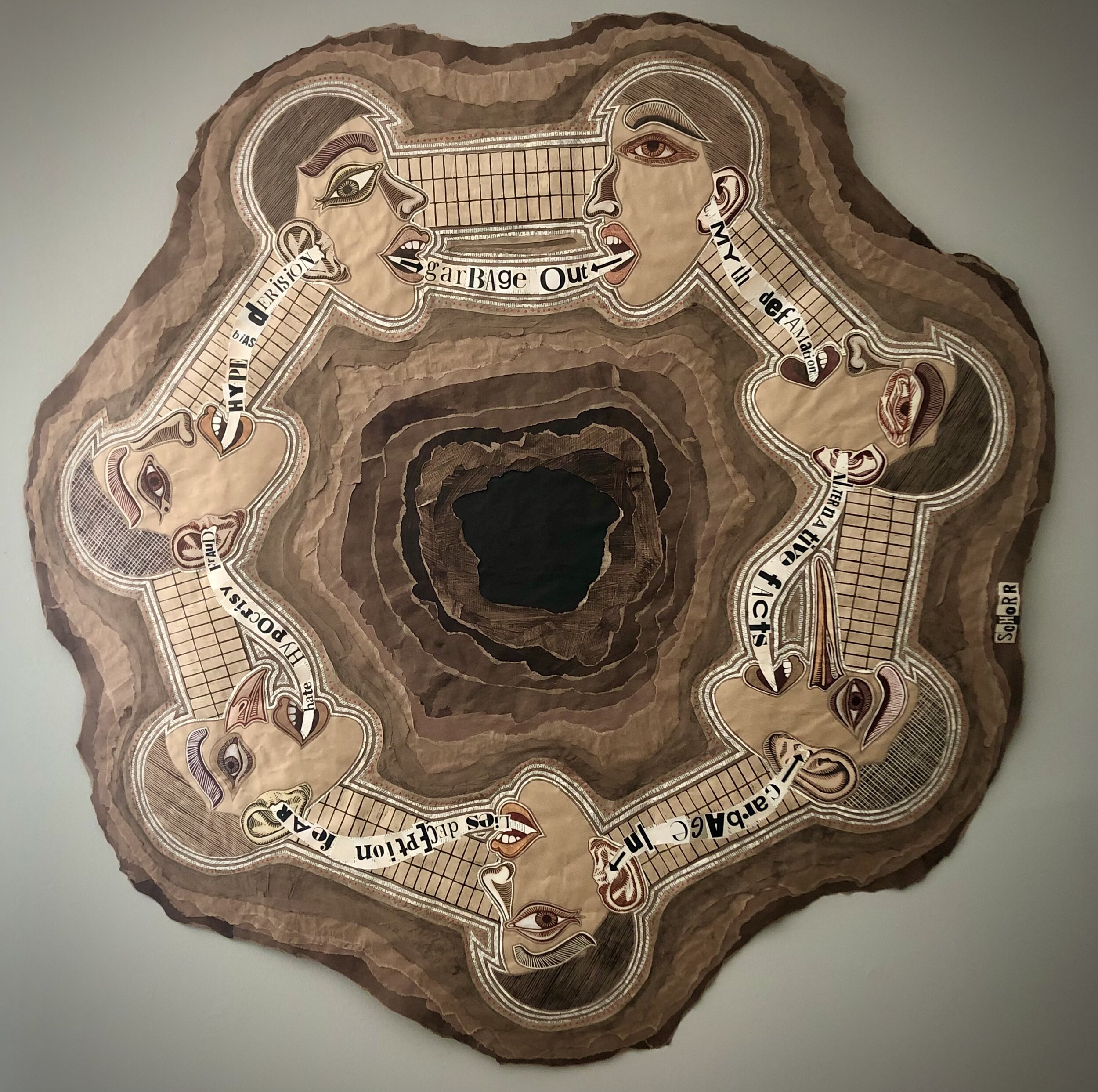
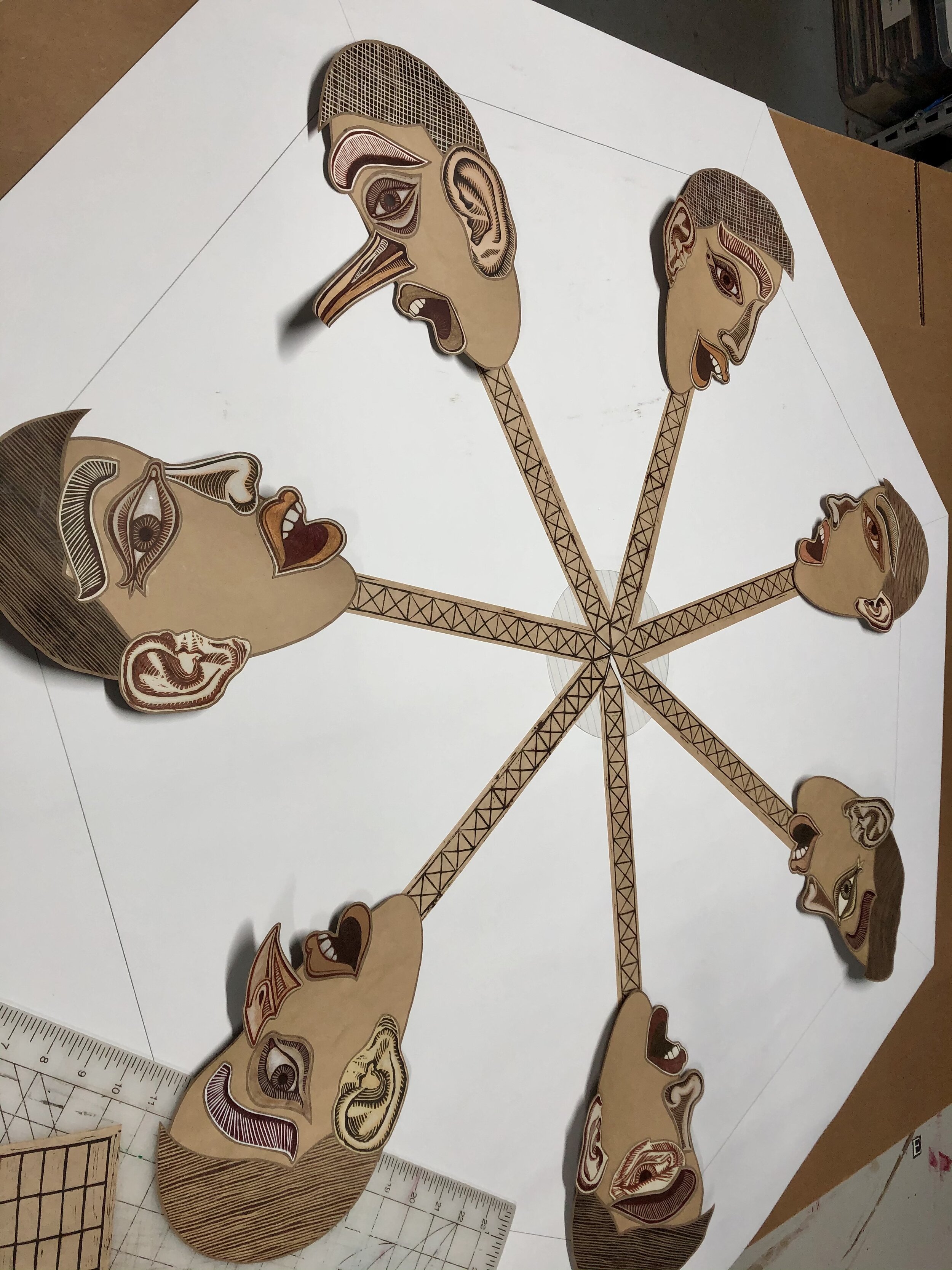
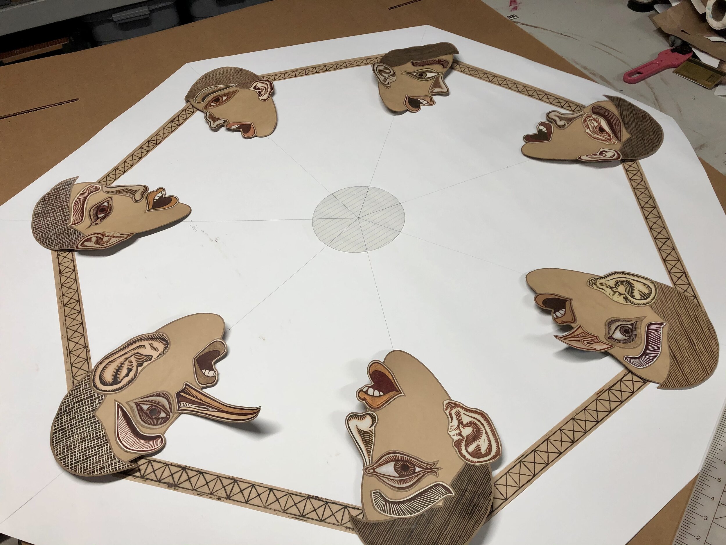
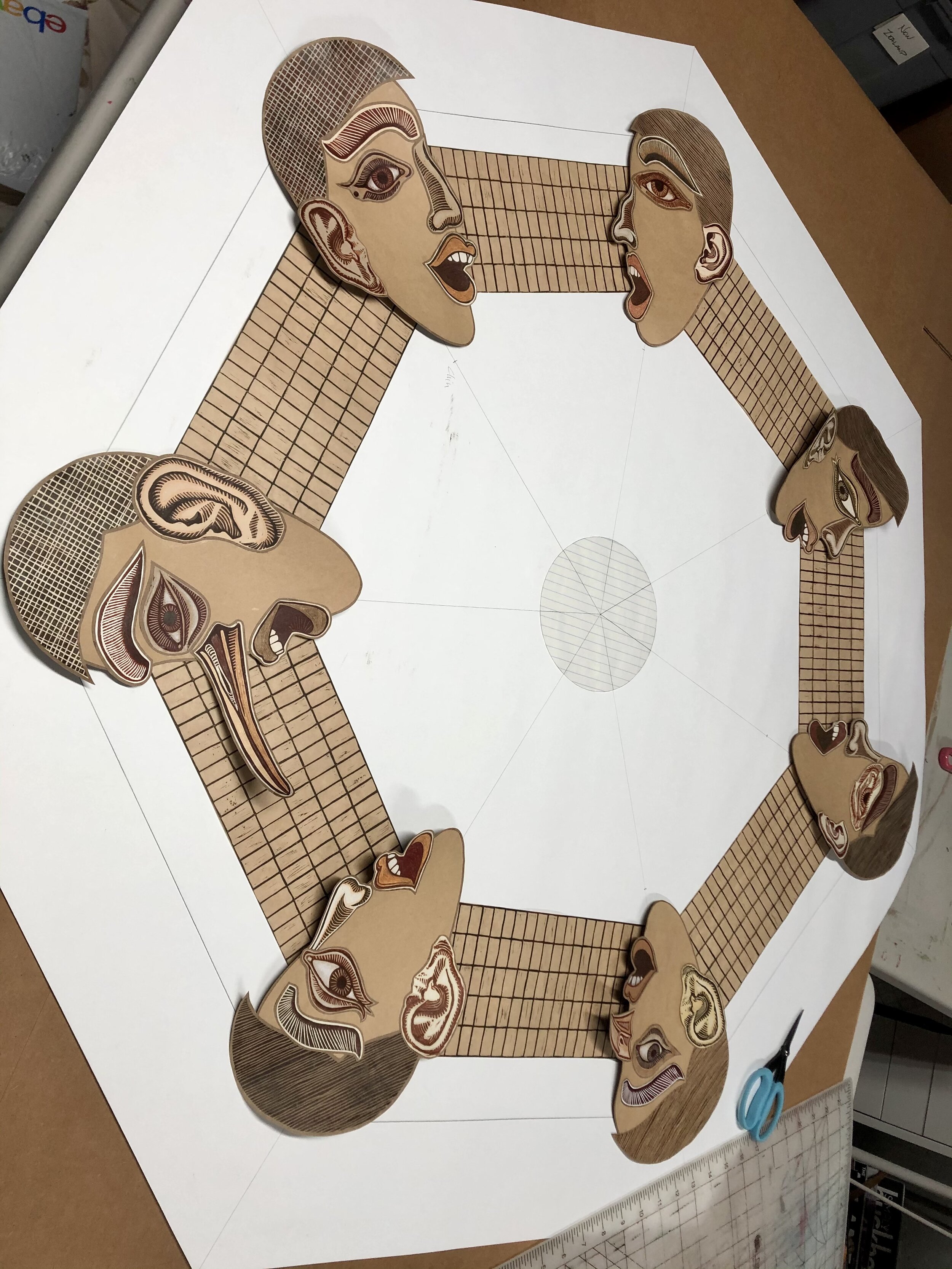
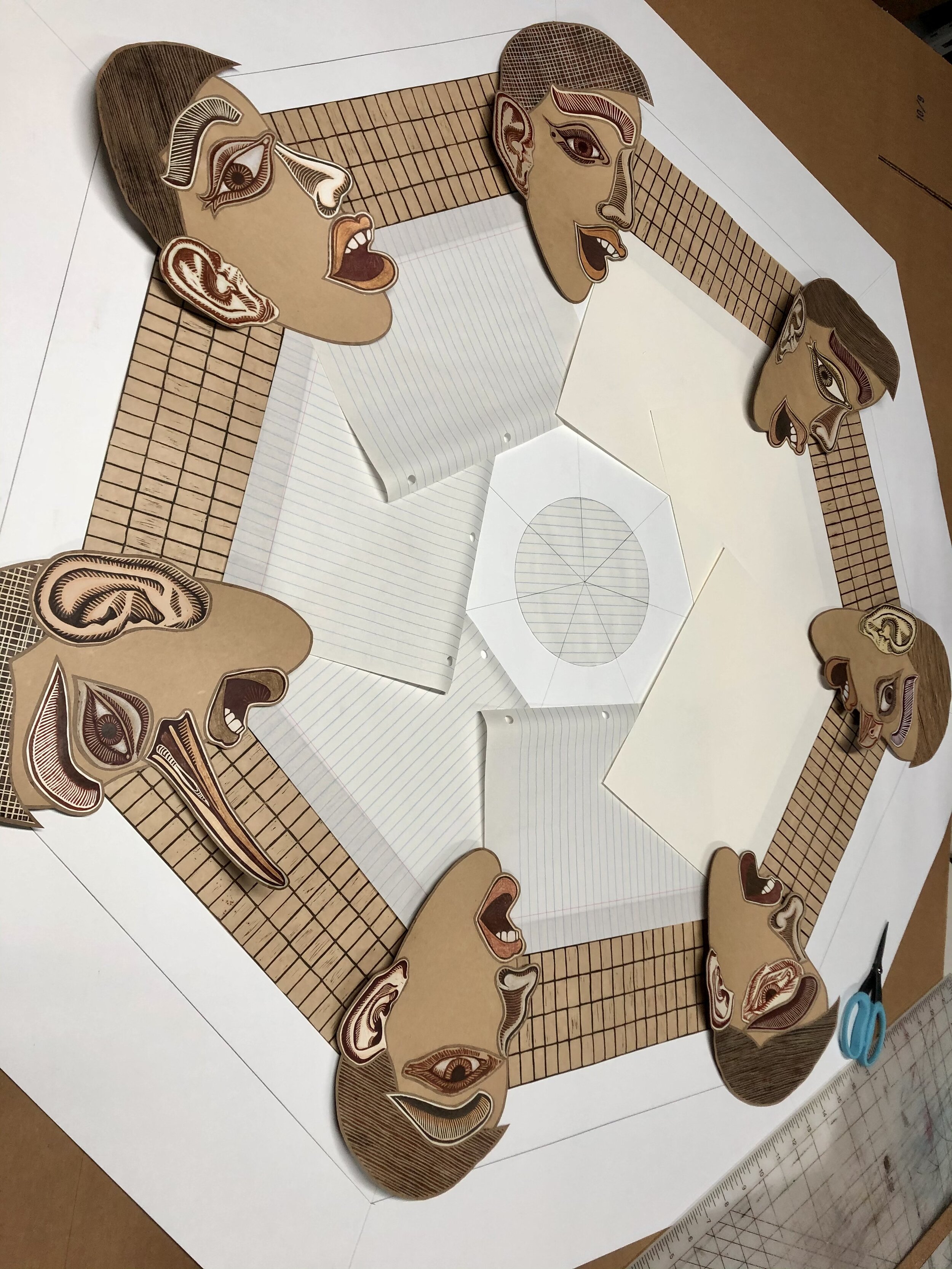
The Echo Chamber, © Natalie Schorr 2021
My husband of 27 years decided that he no longer wanted to be married. I lost my home and my awesome studio space. I purchased a house in Augusta, GA, near my daughter, packed up and moved. The day after I moved in, she was transferred to Colorado Springs.
It was a really big blow. Not exactly ideal, but I am working through the reality.
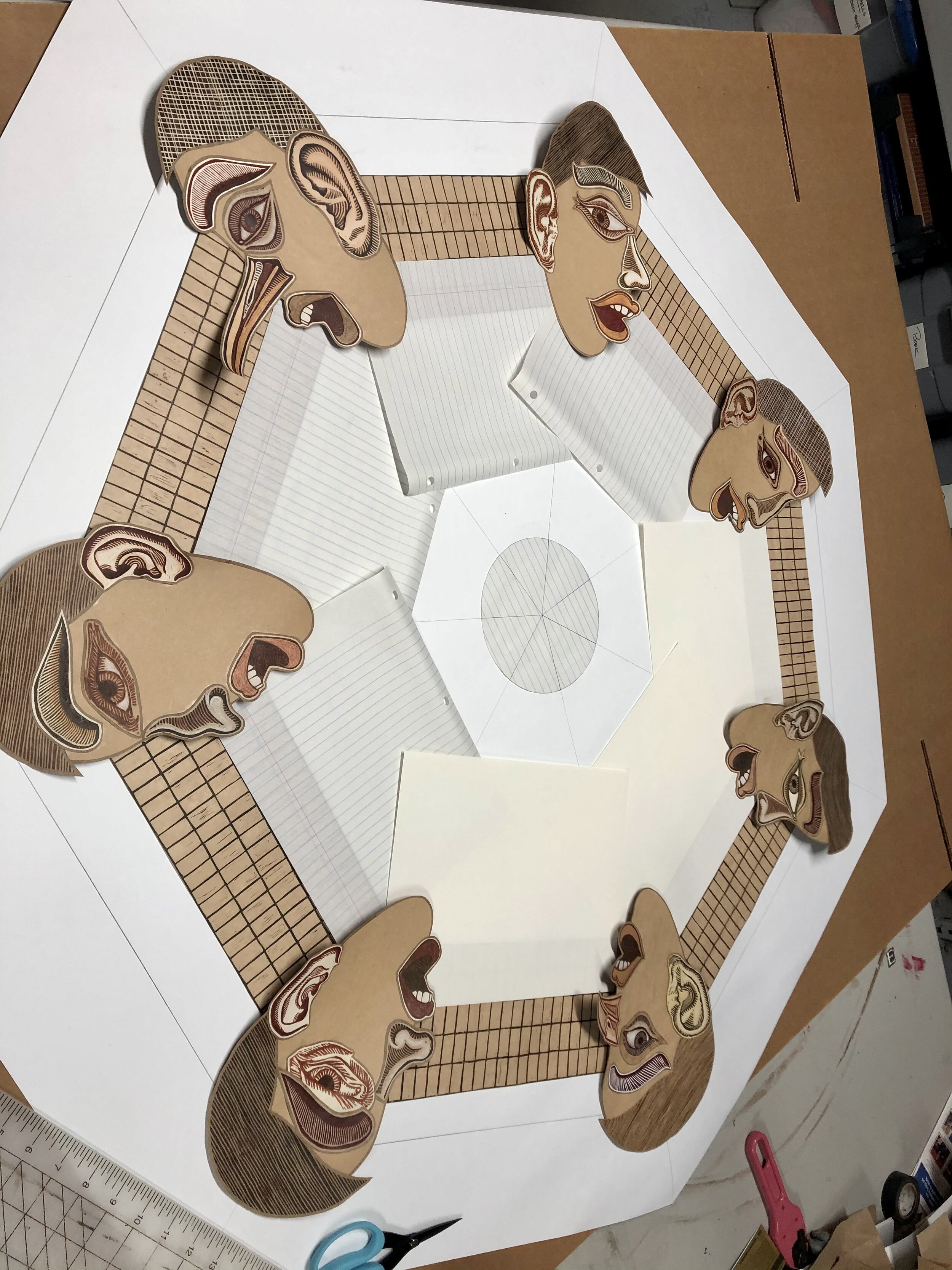
I finally got things set up enough to pull out this piece and get it finished. I had originally planned to make it square, but it got very heavy and sculptural, and I began to like it better as its own heptagon, so I left it that way. It is, of course, inspired by the horrific political climate in which we find ourselves.
So, it’s on to new work and new possibilities.